“Colors speak all languages.” – Joseph Addison
The quote by Joseph Addison depicts a clear-cut image that we come across every day. Sometimes colours can speak a thousand words when the context doesn’t. Have you ever come across a website without even a drop of colour?
The chances are low.
Designing a website with a purposeful scheme of colours has a psychological impact, as they are an important and powerful tool. The use of colours attracts users, increases traffic, conversions, leads, and can even earn a customer’s loyalty. Let us dive into the subject of how to choose the right colours for your website.
Tips on choosing colours for designing a website
Some say to run a business well, an attractive website plays a crucial role. When a customer visits your website, they must get a feeling of excitement or wonder. Let us look at some tips on how to choose the perfect colours for your website:
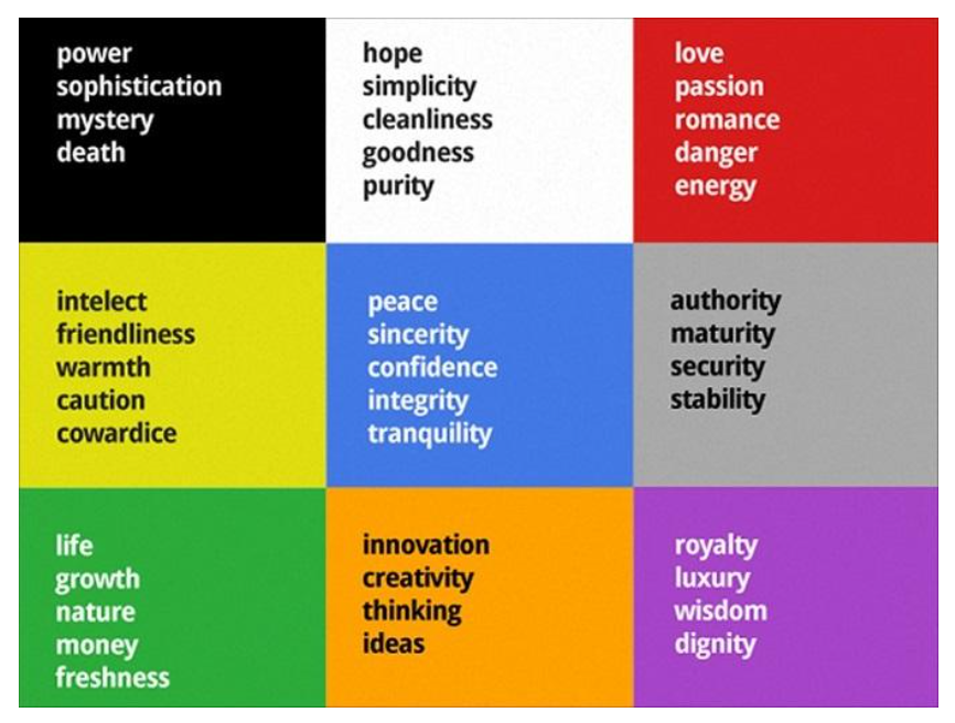
- Psychological basics: When businesses choose a brand colour, it should be different from its competitors and attractive to aid in brand recognition without the help of a logo. Here is some information about colours and what they mean:

As emotions are what drive a customer’s decision-making process, these colours play a crucial role in branding, marketing, and sales.
- Familiarize yourself with colour theory: Colour theory is a framework to determine which colours make for a great combination. Let’s take a look:
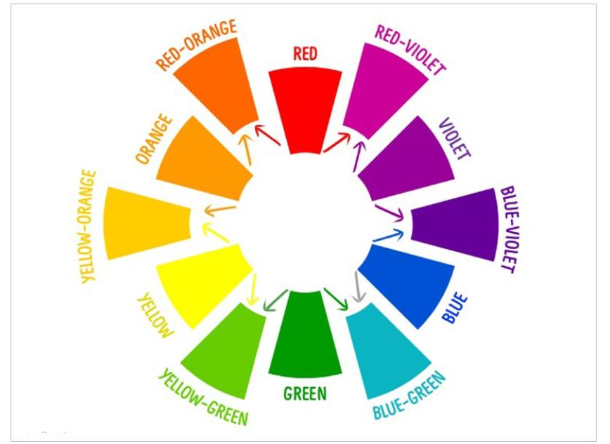
1. Colour Wheel

Here is a small brief to understand colour for web design-
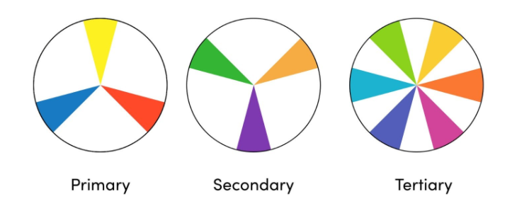
a) Primary colours are those which cannot be made by mixing another two colours. The main three primary colours are blue, yellow, and red.
b) Secondary colours are those which can be created by mixing any two primary colours.
eg: Red + Yellow (Primary colors) = Orange (Secondary color).
c) Tertiary colours are created when you mix a primary colour and secondary colour. Ex: When you mix the primary colour Red and secondary color Violet, you get a tertiary color i.e., Red-Violet.

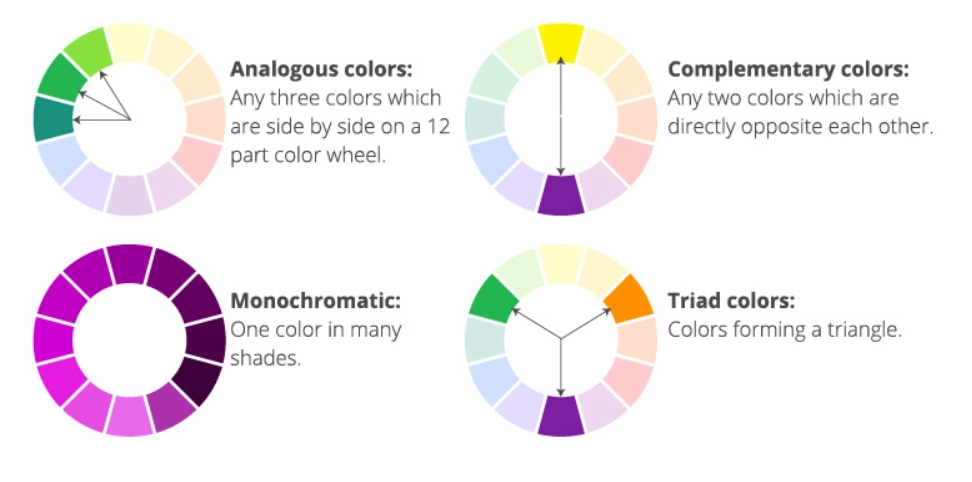
2. Colour schemes

Using the colour wheel and scheme is the easiest way to select combinations. It is also called colour harmony.
- Contrast your colours: When you are in the process of creating your website design, contrast plays an important role. Adding contrast to your webpage can draw attention to certain parts of the page.
If there is something you want users to notice, make it contrast so it stands out and can be spotted immediately.
- 60/30/10 rule: This rule mainly depicts how many colours you want to use in total. It helps harmonize your colour scheme and creates a well-designed interface with perfect balance.
When we break down the rule, it is as follows:
a) 60% of the primary colour
b) 30% of the secondary colour
c) 10% of the accent colour

For example, on this webpage:
Green = primary colour
White = secondary colour
Black = accent colour
Use this ratio as a guide to avoid having too many colors that may distract users.
- Keep it easy and simple: When you add a bunch of colours to your website it can create confusion for the user. Creating confusion makes it difficult for the users to process and understand what is going on. Add standard colours, not more than 3 (ex: blue with a hint of orange in the call-to-action, or even websites with green initiatives will only have green on their websites). Try to make the use of colour relatable to your business as it will be more effective, but avoid using too many as this may confuse users.
Looking ahead
You may now understand why it is important to choose the right colour for your website. To achieve online success with a wide target audience, colour plays a crucial role. With attractive colours, it helps users to remember and store images in their minds much more efficiently than dull colours or none at all.


on
I do believe colors impact people both physically and cognitively. Many food companies display ads that are filled with the colors red and yellow. Red is supposed to induce hunger and the yellow is supposed to induce a welcoming sense of well being. Together, the colors red and yellow allow consumers to feel the need to visit a certain companies establishment to get food.
I’ve been using colors to both get the consumers attention and to affect them at a subconscious level on my website. Using different colors seems to work perfectly well to get visitors’ attention. I hope you don’t mind if I save the list of colors and their effects for future reference.
on
Choosing the right color for a website is something I have been thinking about not too long ago. I tend to like the orange color. However, I don’t know which type of websites may benefit the most from this color.
In your article, Priya, you have listed the word “ignorance” as something negative that can be associated to this color. Thus, I am thinking that perhaps the orange color may be a better choice for websites that are not about providing vital information.
on
Great series on color! Really enjoyed the way you presented it, and especially liked the color charts!
Thank you!
on
While I agree with most of the article, blue has nothing to do with fear, that would be yellow.
on
Taryn, the colour wheel you suggested is very helpful. Thanks for the tip. I also use Color Scheme Generator: http://colorschemetools.net/colorschemegenerator. It's been quite useful. Any other tips, info, or advice on color schemes would be great.
on
Hey Kevin, I’d use the colour wheel here : http://gxi.co.za/building-your-brand/196-choosing-the-correct-colours-for-branding.html
on
We’re trying to figure out best colors for our flag site. Any suggestions? World Flags and Flags
on
A real eye opener. I firmly believe that colours do play an important role in deciding who will stay and who won’t stay back to learn more about your website. Very important to choose the right colour for your website, taking into consideration the niche, the geographical location as well.