Your website is one of the most prominent faces of your business and therefore plays a key role in guiding your customers towards conversion. It’s important that your website represents you and your company but it must also be a pleasing virtual space for customers to visit. Here are a few quick and easy ways to refresh your website for 2017 and to help improve visitor traffic.
Colour Scheme
Be careful not to overwhelm visitors with a busy looking website. Limit your design to between one and three colours. Here are a few suggestions for improving your colour palette:
- Choose one principal colour to use in blocks throughout your website, highlighting important information.
- Use colour in your tab menu.
- For your secondary colour, choose a lighter/brighter option to contrast with the principal colour.
Here are some great free colour palette resources to help you choose the right colours. They even have explore sections that have pre-made colour palettes based on themes.
https://color.adobe.com/
http://colorschemedesigner.com/csd-3.5/
Fonts
When choosing fonts for your site, your first priority should be legibility. Make sure your font size is between 14-24 points so the reader will be able to easily read the content. Google Fonts has a wide range of fonts to choose from that are compatible on various platforms.
You should also avoid overwhelming the reader by using too many font styles. Stick with two fonts styles for the entire website, one for headers and one for the body copy. If the font you selected has a large font family (thin, regular, medium, bold, etc) you can use these various weights within the font family and create a hierarchy within these weights. Just remember to stay consistent — if you use bold font in 20 points for subheads, use this same font across all subheads on the site.
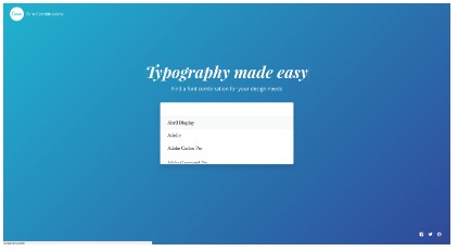
If you’re having trouble selecting a pair of fonts that go well together, try these websites:
https://www.canva.com/font-combinations/
Imagery
The imagery you choose allows the visitor to connect with your company and your services on an emotional level. Taking images yourself adds more value and gives your visitors a glimpse into your company. Include images of your location's interior and exterior, product shots or of people interacting. Readers rely on images to feel that your company is trustworthy and genuine.
Things to avoid when using your own imagery:
- Small images - It's important that your images do not look pixelated and distorted. Make sure your image is 1,400 - 2,000 pixels wide for a full header image.
- Low res images - Make sure your image is saved as a jpg with a high resolution to get the sharpest images.
- Keep your imagery simple, especially if you are including copy over it.
- Low light images - Make the image bright and happy!
White space
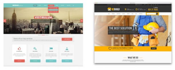
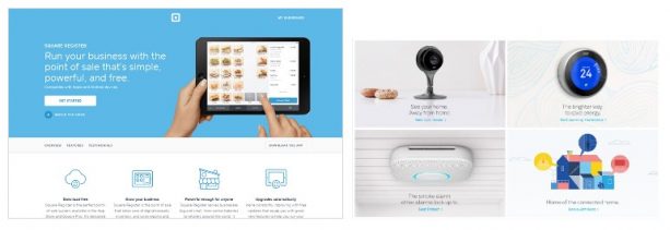
Less is more when it comes to laying out your content. If you have heavy copy going across the page, try separating it into 2-4 columns. For example, if you have four services, separate each one and describe each in brief paragraphs.
Use bullet points to explain key points on your homepage, you need the reader to be able to quickly skim the page and know what you do.
Break up long sections of content with imagery to give the reader's eyes interest to keep reading.
Here are some examples:
CTA Buttons
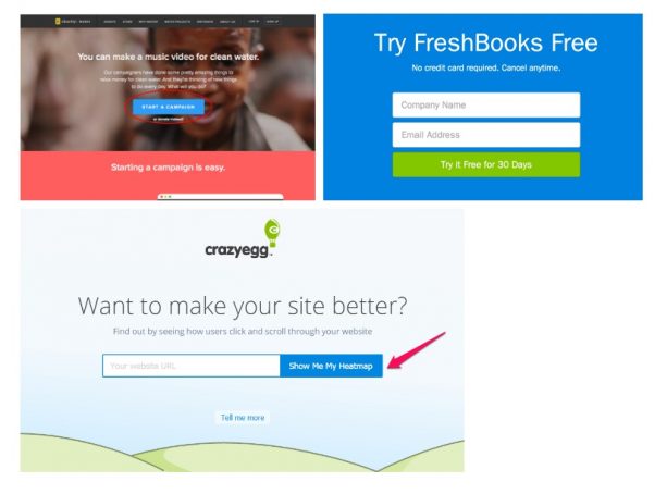
Call-To-Action(CTA) buttons can be in various shapes, sizes and colours but the end goal is the same for all, to complete a conversion. If you notice that you are not getting as many conversions as you would like or you’ve been wanting to change your buttons for A/B testing, then try these tricks.
- Colour is important — select a contrasting colour based on your primary website colour, this will allow the button to stand out and catch the readers eye.
- Make sure your CTA copy is larger font size than your body copy but smaller than your header pt size. The reader should quickly know what the button says.
- Make your button wide enough that the copy in it has a lot of white space around it. This will allow it to stand out more.
- Change the copy to first person. Make your customers feel the need to click the button.
- Copy length should be straight to the point — keep the copy to 2-5 words.
