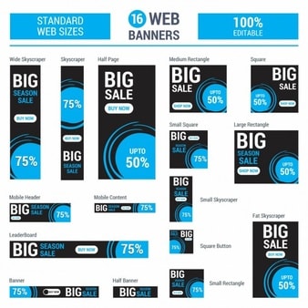
One of the most cost effective forms of online advertising is using web banners.
You can see these scattered on the various websites you visit on a daily basis. The main goal of these banners is to drive traffic to a website by linking to the ad, but over time website visitors have been able to funnel out these ads due to constant ad placements. Web banners are still a great way to promote your business, but you need to elevate the design to grab your reader's attention. Here are 5 tips to make more compelling ads:
1. Use bright and contrasting colours

Bright colours will always stand out on a website with a white background -- so choose any one colour you would like to use. It can be dull, but be sure to make your second colour vibrant. This being said, you need to find a fine balance when using bright colours. Make sure it isn’t overwhelming as this can turn visitors away. An easy way to incorporate a bright colour is to use it on your CTA button. This will direct visitors eyes to the main goal of clicking the ad. Here are a few great examples of using colour.
2. Strong CTA phrases

Sometimes all your ad needs is a stronger CTA to get visitors to click. Your CTA phrase needs to be relatable to your audience. Some call to actions might work better than others, but knowing what you want to offer can help you to refine your copy. Having more of a personal touch can make the visitor feel like you’re talking to them. Using the word “You” can personal your ad for better targeting. Some other converting words are results, limited supply, today only, try it free, start your free trial, sign me up, and request invite.
3. Consistent branding

When you have consistent branding, your business will look cohesive, organized and professional across all platforms. This should also apply when designing banners. Make sure all of the banners sizes look consistent with each other and with ads you have created in the past. If visitors have seen an ad of yours in the past and it did not follow your branding, it might confuse the viewer if its the same company.
4. Maintain hierarchy


The hierarchy of your messaging can play a role in conversion rates. You may have strong copy but if the wrong words are emphasized, your message can get lost. Make sure that the words you want to emphasis are larger so that the reader can quickly skim it and know what the banner is promoting. Keep in mind that your eyes read from left to right and top to bottom so try to emphasis the first few words rather than the last few.
5. Animation
Static banners, though well designed, will be less likely to grab your attention than an animated banner. They have grown in popularity the last few years due to more creative possibilities, additional messaging space, and being able to grab readers attention quicker and longer. It doesn’t need to be too complicated -- you can have elements such as your image/graphics, copy, and CTA bottom come in as different slides. Animations that are less than 15 seconds and loop a max of three times perform the best.


on
Thanks for the friendly reminder of how to make better visual ads. I will keep these in mind when I start making my new set of ads. Looking forward to more articles like this one!
on
Glad to reach your post…! Thanks for sharing this blog with us & I hope you will continue to have similar posts to share with everyone.