What Are Microinteractions?
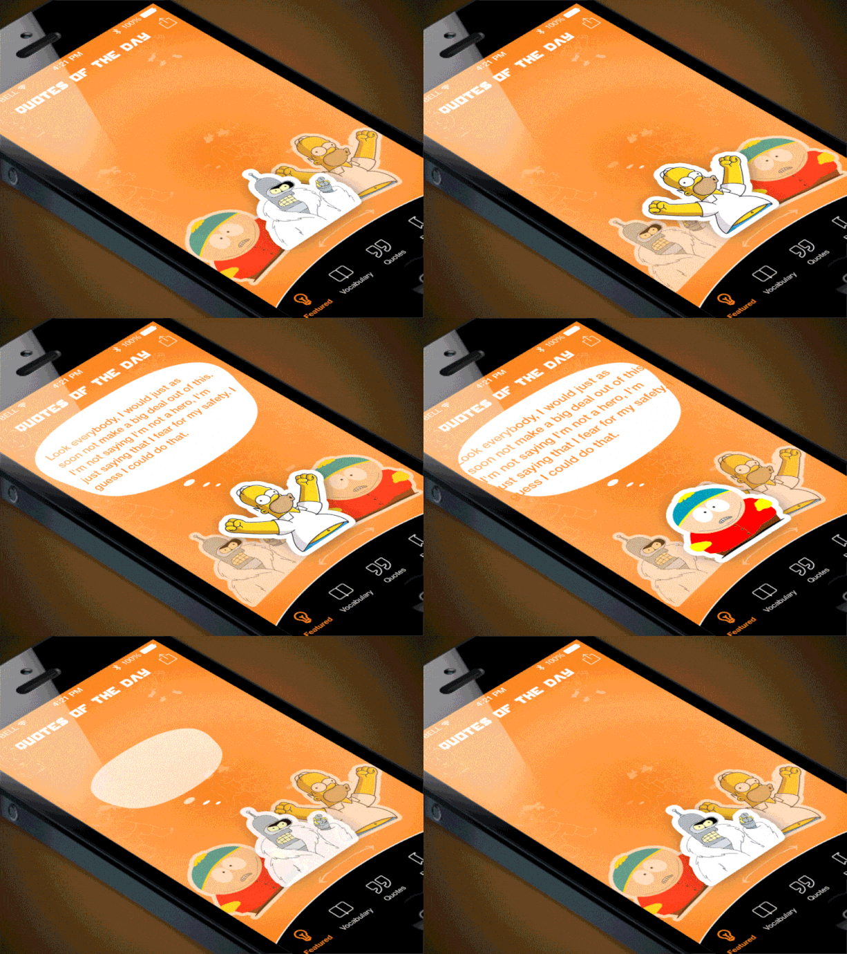
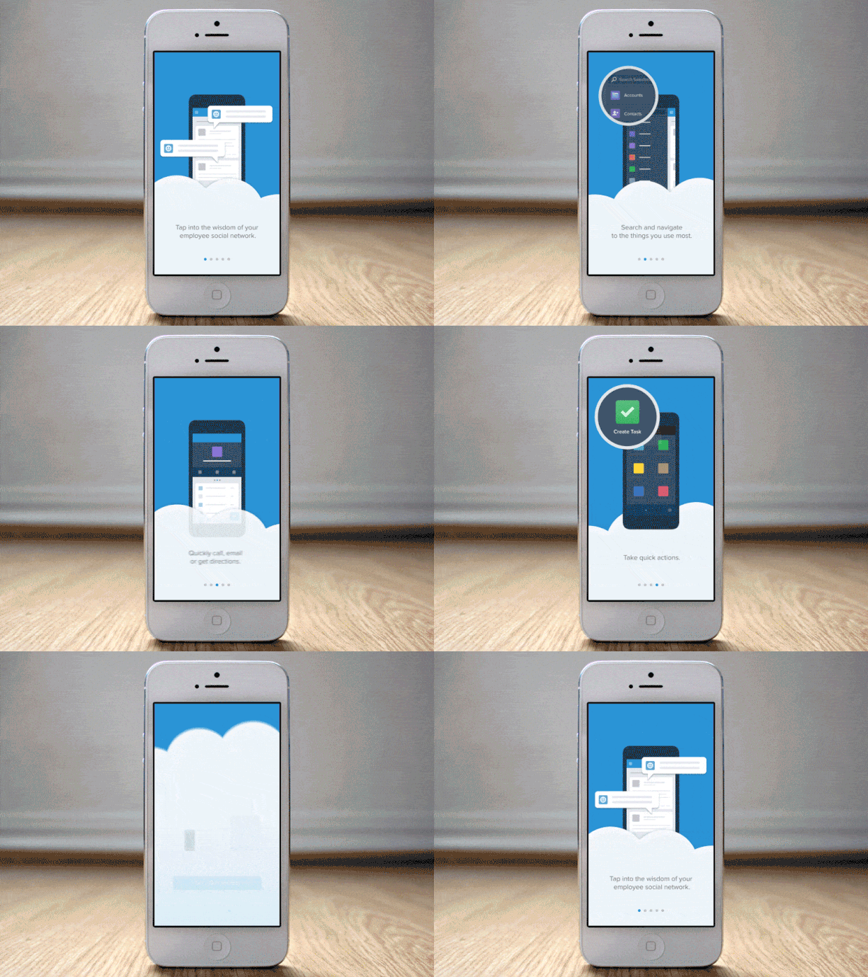
Microinteractions are subtle yet significant moments surrounding one single task. In simpler term, a microinteraction occurs when a user is triggered to perform a task and receive feedback or a reward upon completion.
Microinteractions can take place within a website or mobile apps and are becoming increasingly popular as one of the design trends to watch for in 2018. Whether it’s browsing a site or swiping through your smartphone, we encounter microinteractions far more than you'd expect. They are there to guide and prevent us from making technical mistakes. For example, when we log into a site, change a password, 'like' an Instagram picture, save a Facebook link or comment on a colleague’s Linkedin’s status - we are interacting with microinteractions. They are everywhere in our digital world and even in our homes.
Microinteractions empower users to be in charge of their own interactions and get rewarded by completing much-needed tasks. The integration of microinteractions is crucial because it improves user experience and reduces frustration. According to Business 2 Community, 91% of unhappy customers who are non-complainers simply leave. Therefore, it’s important as a business to retain your customers as 67% of customer churn is preventable if the issue was resolved in the first engagement.
Why Do Microinteractions Work and Why Users Like Them?

Microinteractions work because they appeal to our human nature which is our need to receive validation and acknowledgment for our work. In terms of cognitive psychology, this concept addresses our deep desire to be more in control by providing us with immediate feedback, having access to instructions, receiving a reward, and meeting our visual expectations. Aside from providing us with much needed information, they can be fun to interact with.
By receiving constant feedback and engaging with these microinteractions, we can gain more confidence in our ability to perform certain tasks no matter how technical they are.
A carefully designed microinteraction contain all four of these elements:

- Trigger: Initiates a microinteraction
- Rules: Determines what happens next
- Feedback: Let the user know what’s happening
- Loops & Modes: Determines the meta-rules of the microinteraction

These robust and interactive steps work seamlessly together to let users know that they have completed certain tasks without becoming a design nuisance. Since these microinteractions are so small, they make doing simple tasks more enjoyable and exciting. For example, Facebook “emoji like feature” lets users pick from several emotions making the process of interacting with their friends more fun. Another simpler microinteraction is when we receive a confirmation right after we log into a site. These small details make the process of human-computer interaction easier.
Ways To Improve User Experience

Consumers often make purchase decisions online in a matter of seconds. Therefore, it’s important from a business perspective to create multiple microinteractions that provide immediate feedback and entertains users.
By optimizing these microinteractions, we can guide users through the entire customer journey. Users can choose from several different products, add them to a shopping cart, receive feedback on the items they have added, then be reminded to complete the purchase.
Identify users wants and needs in order to create clear calls to action throughout the entire process. Keep it fun and simple with minimal effort required. The use of microinteractions is meant to engage users and keep them focused. Stay away from heavy animations since it will take more effort to load and might confuse a user.
Key concepts:
- Simplicity is key: Keep your web design sleek and modern so users can focus on completing the necessary milestones towards conversion.
- Details, details, details: Pay attention to detail. Since microinteractions are small, the details within will need to be minimal yet impactful. Each interaction needs to be meaningful and necessary.
- Human-centered interactions: Incorporate user-centric web design by troubleshooting where they might go wrong.
- Response time: Have a fast and effective response time to ensure that users know they have completed certain tasks and can move onto the next objective.
- The balance between animation and information: Include compelling images and helpful information side by side to demonstrate the flow of your design.
- Clear call to action: Emphasize what the next step is. Some examples of microinteraction features include a form fill, system status, interactive tutorials, and red buttons.

Remember that microinteractions are small moments with powerful results. These microinteractions are incredibly influential because their functions intertwine with how users interact with our brand. Some of the best website designs integrate microinteractions to encourage their users to participate and create habits. By incorporating powerful microinteractions into our design we can improve user experience and above all create dynamic and responsive interactions
Want to learn how to get more leads for e-commerce business? Call TechWyse Internet Marketing today at 866.288.6046 or contact us here.


